

How 2020 Democrats could rewrite the rules of political typography
How 2020 Democrats could rewrite the rules of political typography

Illustrations by Blake Pack
Some of the Democratic presidential candidates resemble their campaign typeface.
You can see it in Abolition, the tall, condensed typeface used by the lanky former Rep. Beto O’Rourke (Texas).
Brother 1816, the geometric typeface used by former Vice President Joe Biden’s campaign, evokes a free-wheeling fraternalism fitting for his aviators-wearing “Uncle Joe” persona through its name and details like triangular As, Ms, and Ns, and a playful, curved Q tail. Some letters look like quirky cousins to Gotham, the typeface used by former President Obama’s campaign.
And of course Industry would be used by a candidate from the Midwest. Industry is one of the typefaces used by South Bend, Ind., Mayor Pete Buttigieg’s campaign. Described as capable of looking both “refined vintage” and “industrial futuristic,” it was designed by Fort Foundry, the same type design studio that made the O’Rourke campaign’s Abolition.
Like much of campaign visual rhetoric, typography can seem like an afterthought. Campaigns were once limited by whatever type their printer or other vendors had available. Even today, design can take a backseat to other campaign priorities when budgets are tight.
But the distinctive fonts used by Democratic primary candidates signals there’s a greater emphasis on political typography today. Single-letter logos — like the Hillary H, Romney R, or Obama O — are out, and wordmarks are in. The typefaces used by 2020 Democrats could shape design trends for elections to come.
A new generation of typography
“There’s a lot more variety this time than past campaigns,” Doug Thomas, author of “Never Use Futura” and a Brigham Young University design professor, told Yello in an interview.
Unlike the crowded 2016 Republican field, which tended to use similar colors and typefaces, members of the Democratic class of 2020 are “doing their own thing,” and using type to “evoke new ideas,” he said.
To spell out her “Warren” wordmark, Sen. Elizabeth Warren’s (Mass.) campaign uses custom lettering that’s similar to the typeface Brandon Condensed Grotesque and reminiscent of 1920s, ‘30s, and New Deal-era type, Thomas said. It’s paired with Ringside, a strong, condensed typeface, on social graphics and ads. Even Warren’s “Liberty green” is a throwback to the time period, when the color was especially popular.

“It evokes a different era,” Thomas said. “I don’t know how conspicuously those choices are being made, but I’d say that certainly comes through.”
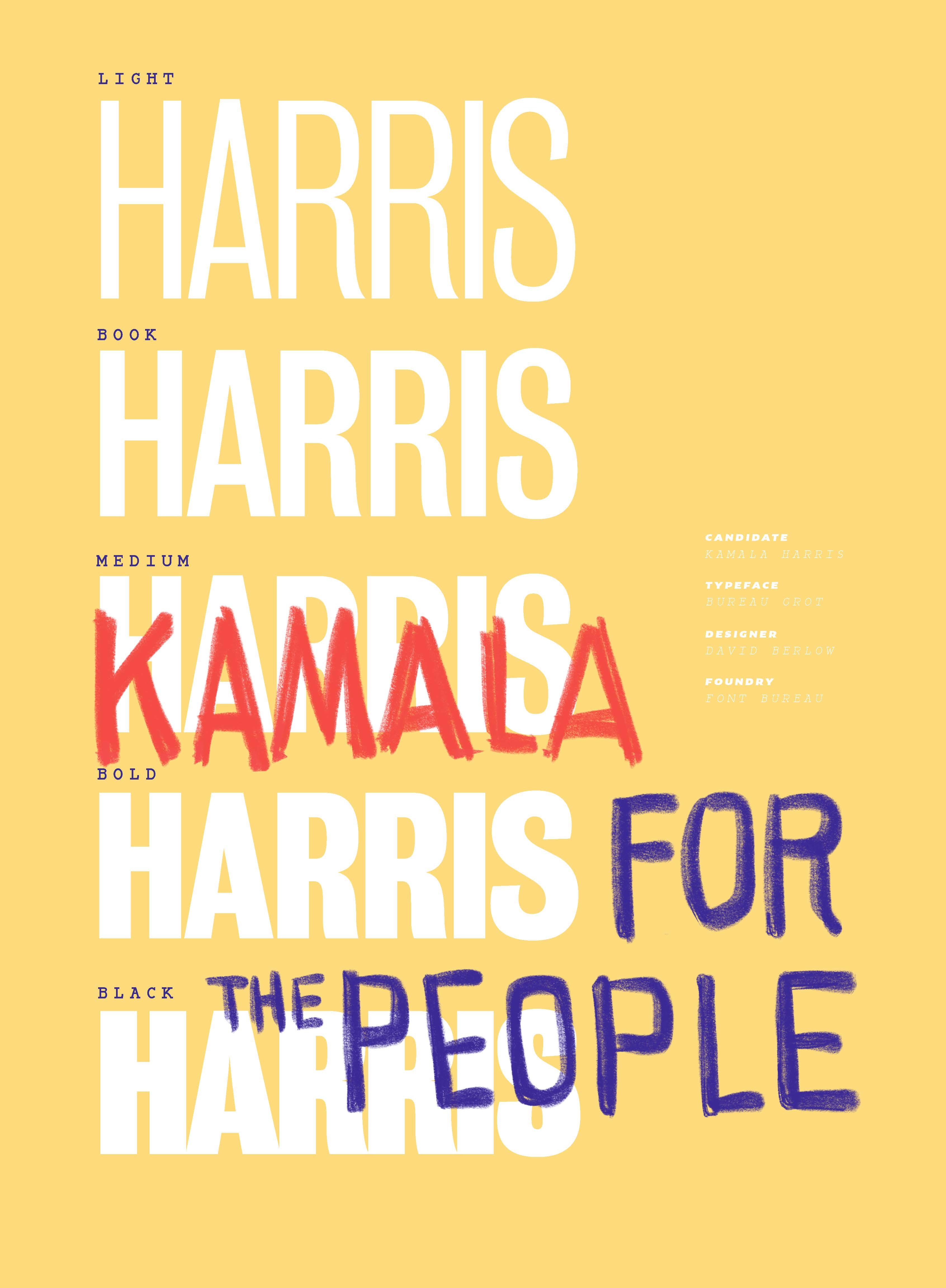
Sen. Kamala Harris’ (Calif.) campaign also uses type to make a reference to the past. The campaign’s use of Bureau Grot is inspired by the tall condensed type used by Rep. Shirley Chisholm, the first black woman in Congress and the first to run for the nomination of one of the major parties.
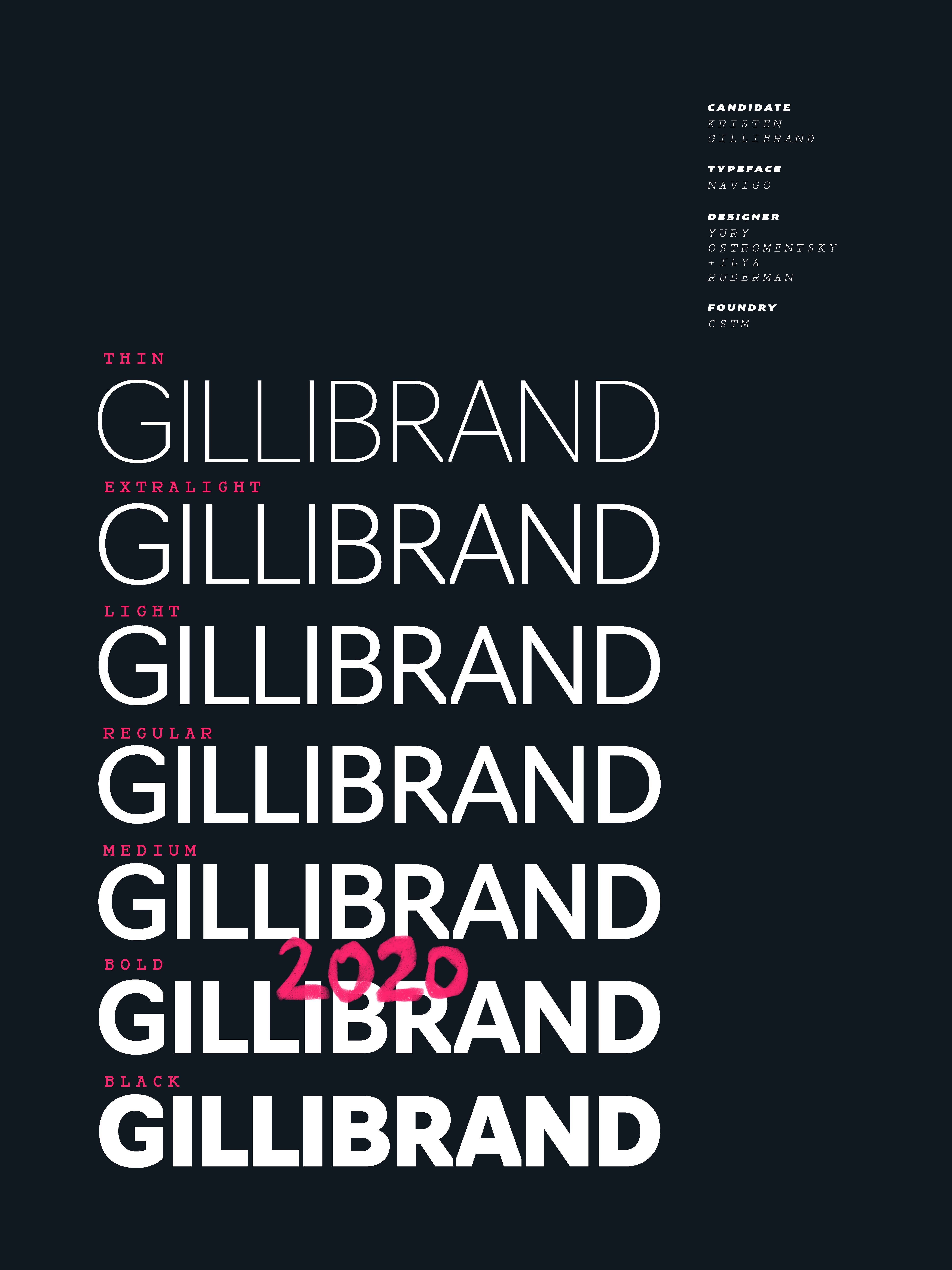
The two campaigns that used the color pink also use type to challenge conventional notions about design and gender. Before dropping out, Sen. Kirstin Gillibrand’s (N.Y.) campaign used bright pink with Navigo, a typeface with sheared edges that when used in a thick weight subverts expectations about thin, lighter weight fonts being associated with the feminine. Navigo was designed as a visual identity for the Moscow City District in Russia’s capital.
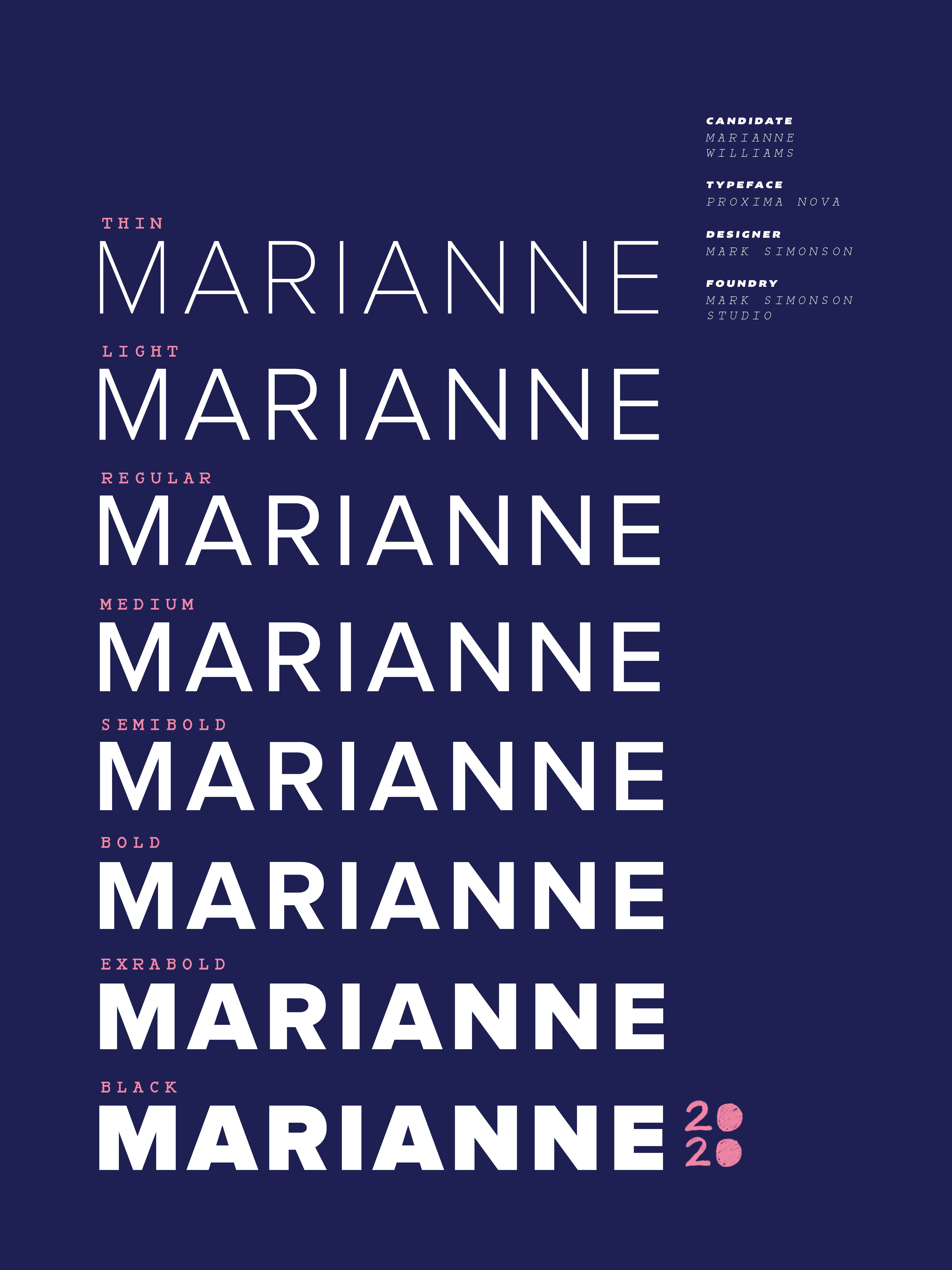
Author Marianne Williamson’s campaign uses a dusty pink that gives a softer look to her use of what appears to be Proxima Nova. Her campaign also uses a distinctive filled-in “2020” mark in its branding and sometimes plays with Hitchcock, a typeface inspired by Alfred Hitchcock film’s title sequences.
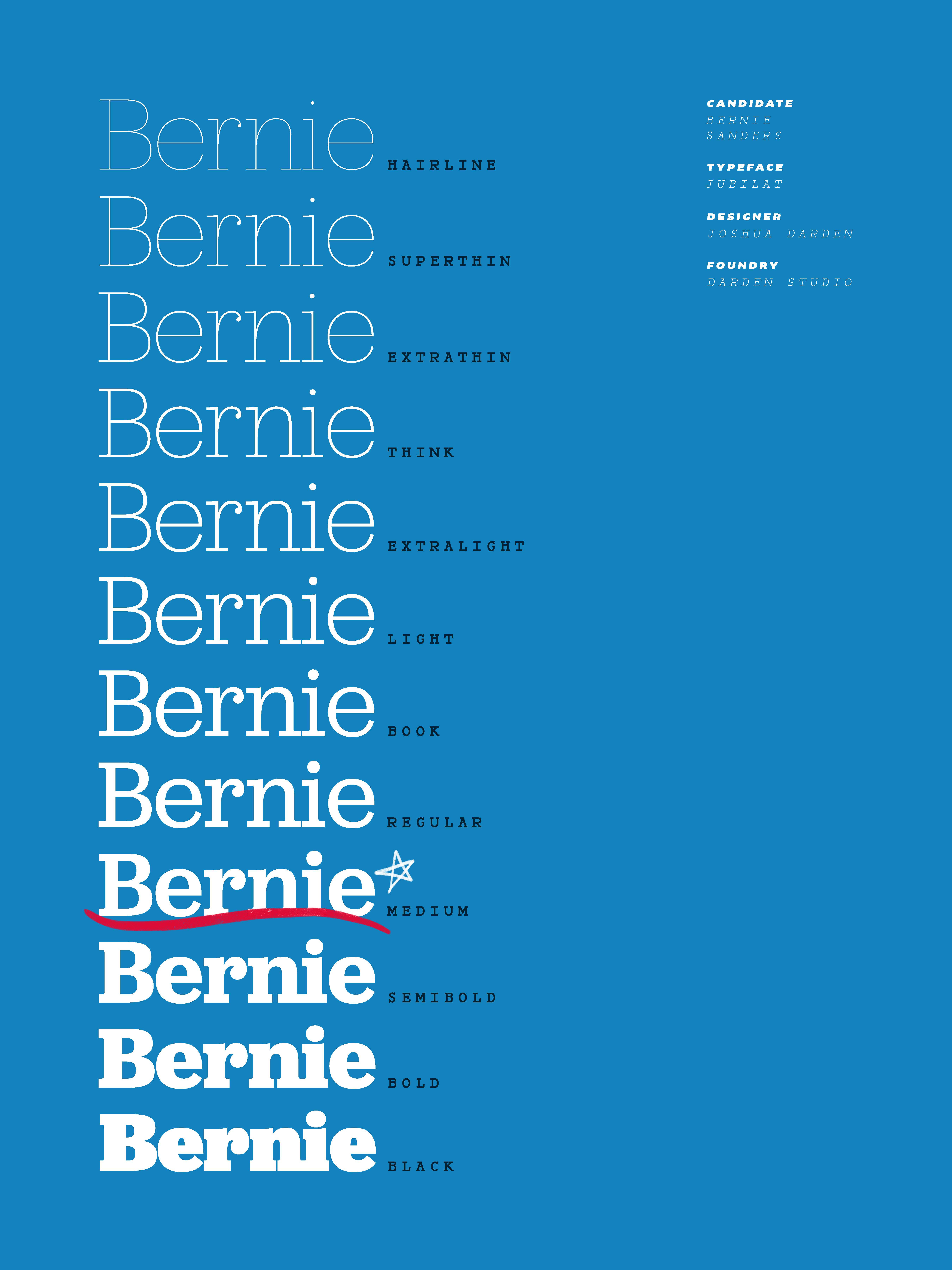
The rare use of serif typefaces stand out from the rest of the field. Sen. Bernie Sanders (I-Vt.) used the slab serif Jubilat in 2016 and is using it again for his 2020 campaign. Along with the wavy red and blue mark in the campaign logo, it has become instantly recognizable and adapted for images like a public health campaign promoting STD checks and a Cardi B mash-up wordmark for Sanders’ video with the rapper.
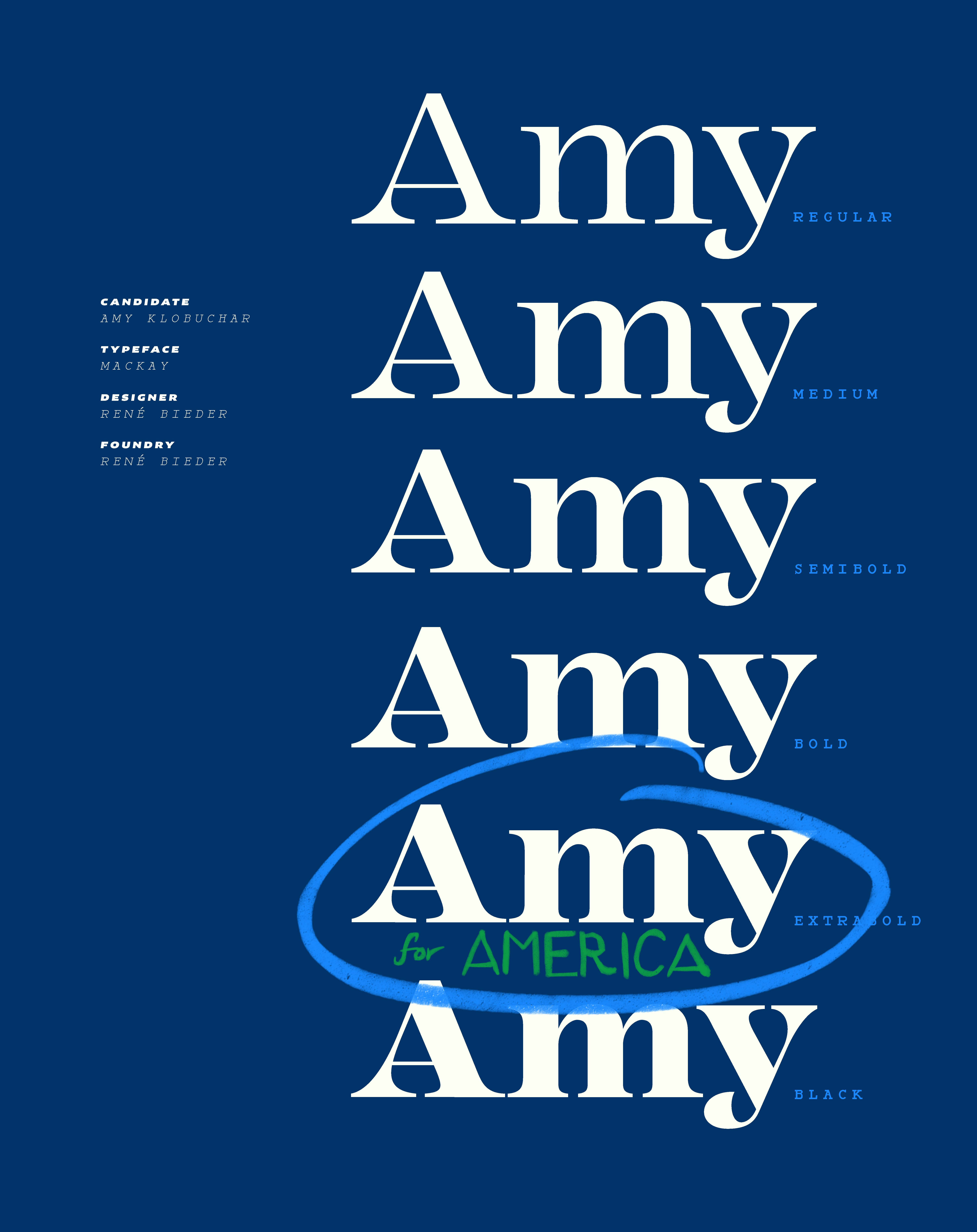
Sen. Amy Klobuchar’s (Minn.) campaign uses Mackay, a generous, full-bodied serif typeface that looks unlike anything else in national politics. It feels relatively ornate, and well suited for a short, simple wordmark like “Amy” as opposed to spelling out the full “Klobuchar.”
More than a bumper sticker
Campaigns today operate across multiple platforms at lightning speed, selling pop-up tees and putting out social graphics on the fly. Thoughtful, consistent typography can go a long way in communicating a message, no matter where it appears.
“I think more effort is being put into this and it’s not just being treated solely as a bumper sticker,” type designer Tobias Frere-Jones said. “Before it was a newspaper ad, a TV ad, a bumper sticker, a yard sign, maybe a couple of other things. Now it’s all that plus more merchandise.”
Frere-Jones designed several typefaces used by presidential campaigns, including Gotham. Originally made for GQ, Frere-Jones was on vacation in Australia when Obama won the Iowa caucus in 2008. He learned his work was being used by the campaign when he saw it in news reports.
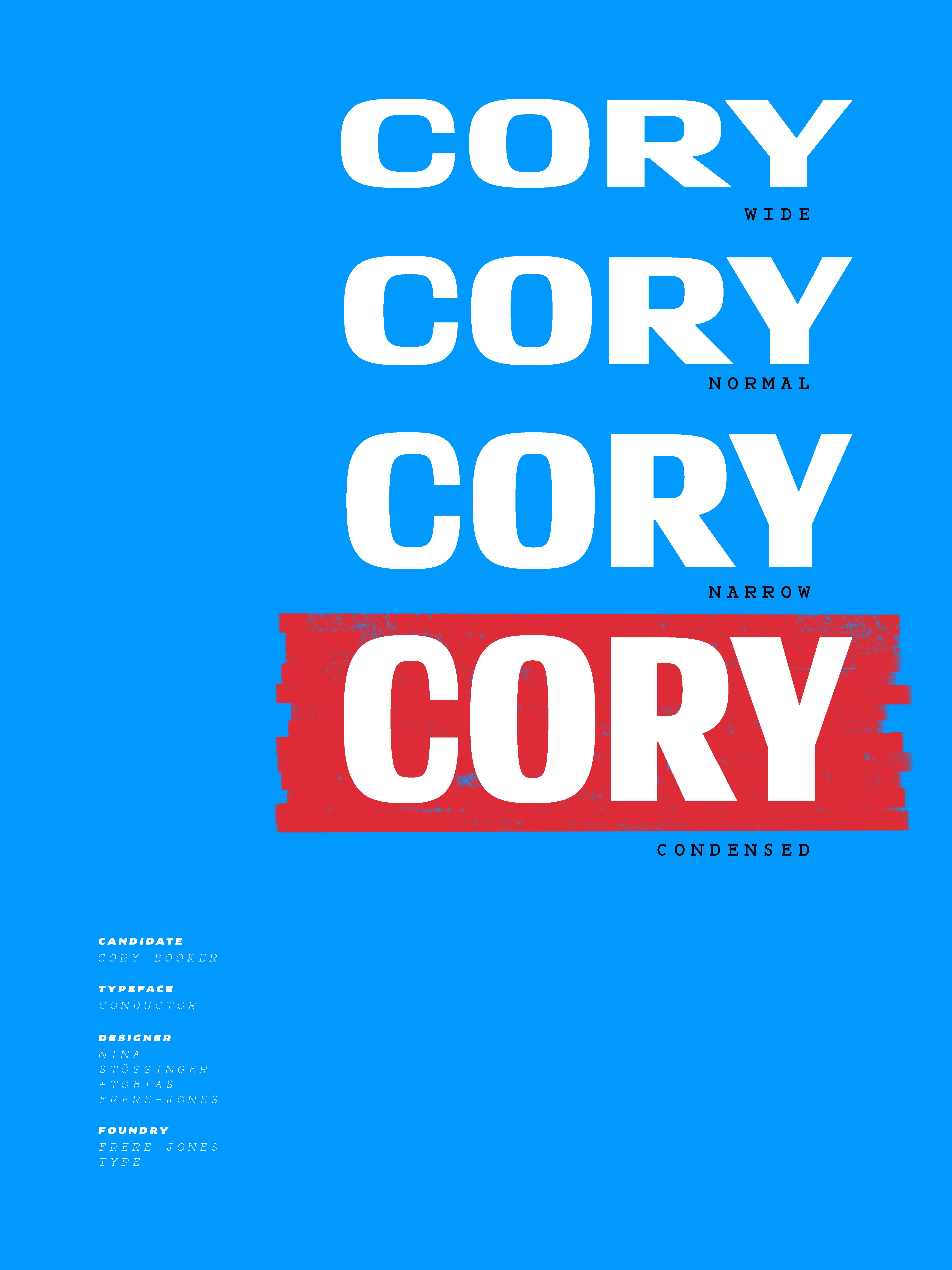
Today, Frere-Jones doesn’t have to wait for the news to find out which candidates are using his fonts, because their teams reach out to him beforehand. Some even ask for customizations, as Sen. Cory Booker’s (N.J.) team did when they contacted him about using Conductor, an expressive typeface inspired by vintage Bulgarian paper lottery ticket lettering. Small adjustments were made to the letters R and Y in anticipation of a “Cory” wordmark.
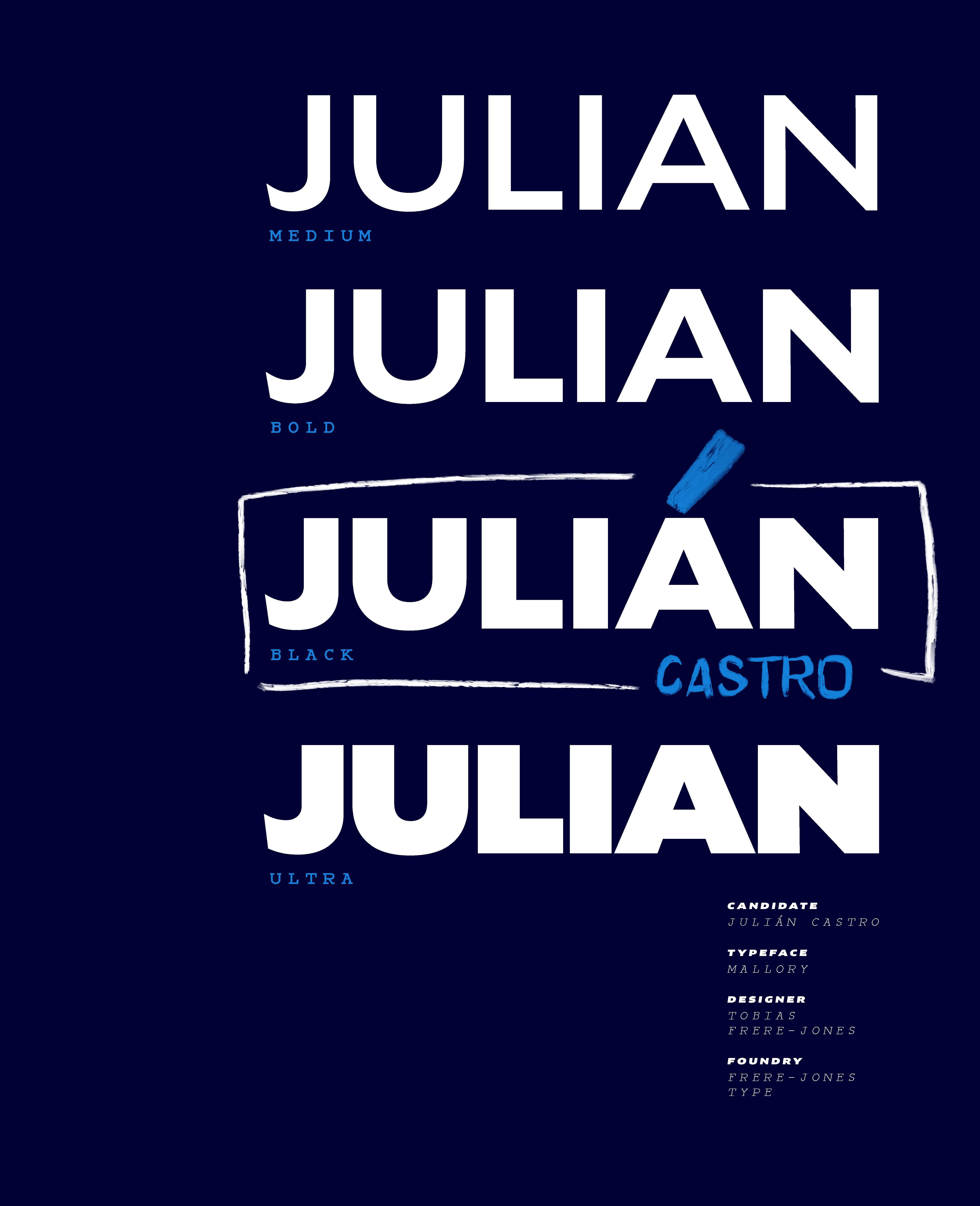
Frere-Jones also designed Mallory, a typeface used by former Housing and Urban Development Secretary Julián Castro. Mallory began as “a personal experiment in dual citizenship” with American and British influences, per Frere-Jones’ site, and Castro’s wordmark emphasizes his heritage with a light blue accent mark. The style of Mallory used by Castro was made available to the campaign before its general retail release.
Campaigns that are doing better in the polls tend to spend more money on type. While candidates like Sen. Michael Bennet (Colo.) and businessman Andrew Yang use free fonts available on Google Fonts, those used by candidates including Biden, Buttigieg, Harris, and Sanders require an Adobe Creative Cloud license. A standard license for the Warren campaign’s Ringside starts at $249 for use on one computer.
What drives political typography trends
The emphasis on typography in politics can be traced back to Richard Nixon’s 1972 campaign, which used the popular sans-serif typeface Futura. Nixon’s reelection campaign made image a priority through the use of planned television events and a level of design sophistication that would not be seen again until Obama in 2008.
Campaign design trends tend to be influenced by winning campaigns, but other events can also leave their mark. After Nixon resigned in 1974 following the Watergate scandal, political type swung far away from his uniform, sans-serif look. The next Republican to get elected, Ronald Reagan, used serif type.
Read more: [Do fonts have a political party?]
George W. Bush and Obama brought the big, bold sans-serif type back, and Obama’s Gotham has become the defacto look of politics. President Trump’s campaign even uses the Gotham-like typeface Montserrat. Hillary Clinton’s 2016 campaign commissioned its own sans-serif typeface. Dubbed Sharp Unity, it was a customized Sharp Sans that used rounder Rs and Ts as well as circles instead of squares to dot the lowercase Is and Js, giving it a softer look.
Subscribe to Yello for the latest news on visual politics delivered each week:
Susan Mirriam, co-founder of the Center for American Politics and Design, said the diversity in political type today, especially among down-ballot candidates, comes in part from campaigns attempting to send a message that they’re not part of the establishment.
“Whether it’s because they’re more of an independent candidate or they’re in a district that is more purple and they don’t want to be defined one way or another … people don’t want to look like they’re part of the party aesthetic,” she said.
Since political typography trends tend to be dictated by the ballot box, it’s impossible to know what styles and typefaces from the 2020 campaign could endure. Should the U.S. elect a President Harris or O’Rourke, we could see condensed type come into vogue. A President Sanders or Klobuchar, on the other hand, could inspire campaigns to embrace serif type. Ringside could replace Gotham as the political typeface of choice under a President Warren.
Regardless, the new emphasis on typography in politics shows it’s not just candidates’ words that voters pay attention to, it’s the way those words look when spelled out on signs, clothing, and Instagram posts.
“The public has grown more visually literate,” Mirriam said.