

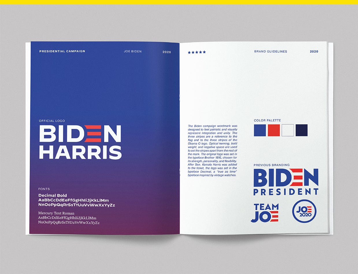
The branding of Joe Biden

The public persona of Democratic nominee Joe Biden is that of an aviator-wearing, Amtrak-riding, gaffe-prone Uncle Joe. Nearly a half century in the making, it’s informed by his personal history, the president he served under, and the emerging internet culture he was popularized in. For Biden’s supporters, he’s seen as empathetic and all-American, a familiar face promising a steady hand to a country in crisis. It’s a political brand summarized visually in his campaign logo.
Biden announced his 2020 candidacy with a logo designed by a team from ad agency Mekanism headed by designer and art director Aimee Brodbeck. It was set in Brother 1816, a typeface chosen for its strength, flexibility, and personality. The red-striped E was inspired by the flag and by the three stripes in Barack Obama’s O logo, Brodbeck said on her site.

The logo was panned at the time. Fast Company said it would unconsciously remind voters of Biden’s handsy moments and the Bulwark called it a high crime against logo design. When Business Insider asked a group of graphic design experts what they thought, they ranked it a 6.7 out of 10. For what it’s worth, Yello said the logo was fine.
The logo also had a callback to Biden’s first-ever presidential campaign logo nearly 30 years before: Biden, President.
Vintage Biden
Biden became one of the youngest U.S. senators in history after taking office when he was just 30 years old in 1973, and he first ran for president during the 1988 campaign. Biden was “a bright new hope, different from other Democrats,” wrote Laurence Barrett, a former Time national political correspondent who covered the race.
“The Democrats had taken two shellackings at the hands of Reagan, and there was this thought, not really based on a lot of facts, that the Democrats were too soft, too feminine, too much into interest politics, and Biden was seen by his own people as an antidote to that — good looking and athletic — who would come across as stronger,” she said.
Biden’s first presidential campaign logo used an italic sans-serif font to spell out his name over a single red line with the word “president.”

Biden dropped out over a plagiarism scandal just three months after announcing his run. It cost him his candidacy because “the basic rap against Biden is that he’s a candidate of style, not substance,” Democratic pollster Geoff Garin told Time. Biden was viewed as a sort of Trojan horse for other’s ideas, a knock he’s gotten in 2020 from the Trump campaign, which has sought to characterize him as a puppet for his party’s far-left wing.
When Biden ran for president again 20 years later, his campaign logo used a serif typeface and star icon. His second campaign lasted about a year, and he dropped out after a poor performance in Iowa.

Months later, Biden was at the dentist’s office for an appointment for his wife Jill when he got the call that Obama had chosen him to be his running mate. He was picked for his foreign policy expertise and appeal among working-class voters, according to a New York Times report at the time, but also because of his “compelling personal story.”
The month after Biden was elected to the Senate, his wife and one-year-old daughter were killed in a car accident. After being sworn in, Biden opted to take a daily commute from Washington to Wilmington, Delaware, by Amtrak train to be with his two sons who survived the crash. The tragedy, as well as of the 2015 death of his son Beau, are sometimes used to explain Biden’s empathy and compassion.
“There are times when I couldn’t even imagine how he did it. How he put one foot in front of the other and kept going,” Jill Biden said during her DNC speech. “Joe’s purpose has always driven him forward.”
Subscribe to Yello for the latest news on the culture, branding, and visual rhetoric of politics, delivered each week:
The Obama era
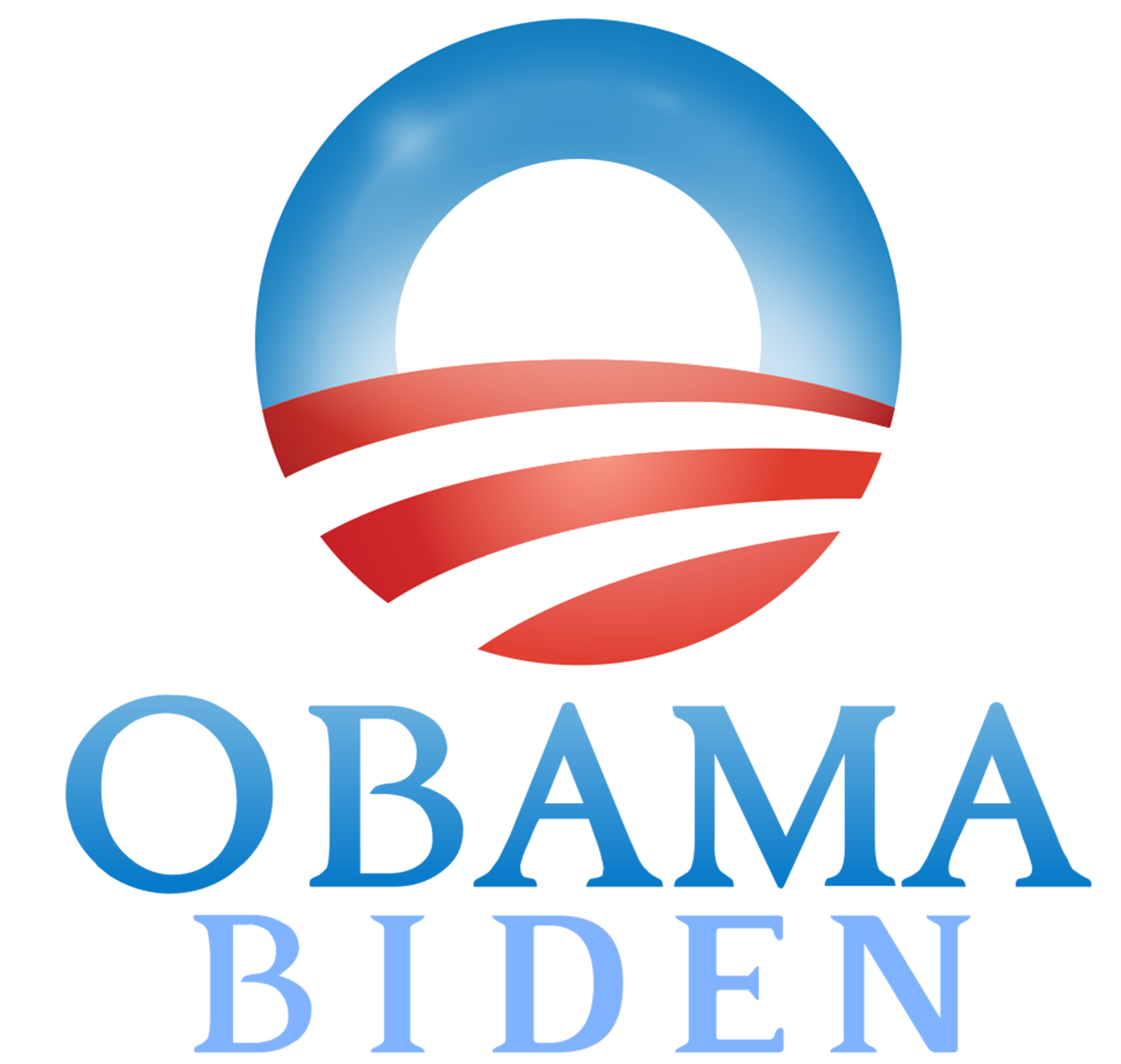
After being added to the ticket, Biden’s name was added to Obama’s campaign logo. The Obama O and the visual identity developed for Obama’s 2008 and 2012 campaigns exerted an outsized influence over political design trends ever since, and Biden was now apart of it.
The Obama administration coincided with the rise of internet meme culture, and Biden was a frequent meme. He was famous for his gaffes, like when he was caught on a mic calling the passage of the Affordable Care Act a “big f*cking deal,” and for being overly affectionate and handsy with women during swearing-ins and other events. It all quickly became internet fodder. There was also “Sad Biden,” a Joe Biden Eats Ice Cream Tumblr, and of course, this tweet.

The most well-known Biden meme, though, was the Onion’s. A May 2009 satirical article headlined “Shirtless Biden Washes Trans Am in White House Driveway” introduced us to Onion Joe, a “creepy but harmless” recurring character who became a running joke for the site. Biden himself called the gag “hilarious” in 2011, but Joe Garden, a former Onion writer, apologized for the parody in a 2019 Vice op-ed, arguing the Onion created a false impression of the man who would become 2020’s Democratic nominee.
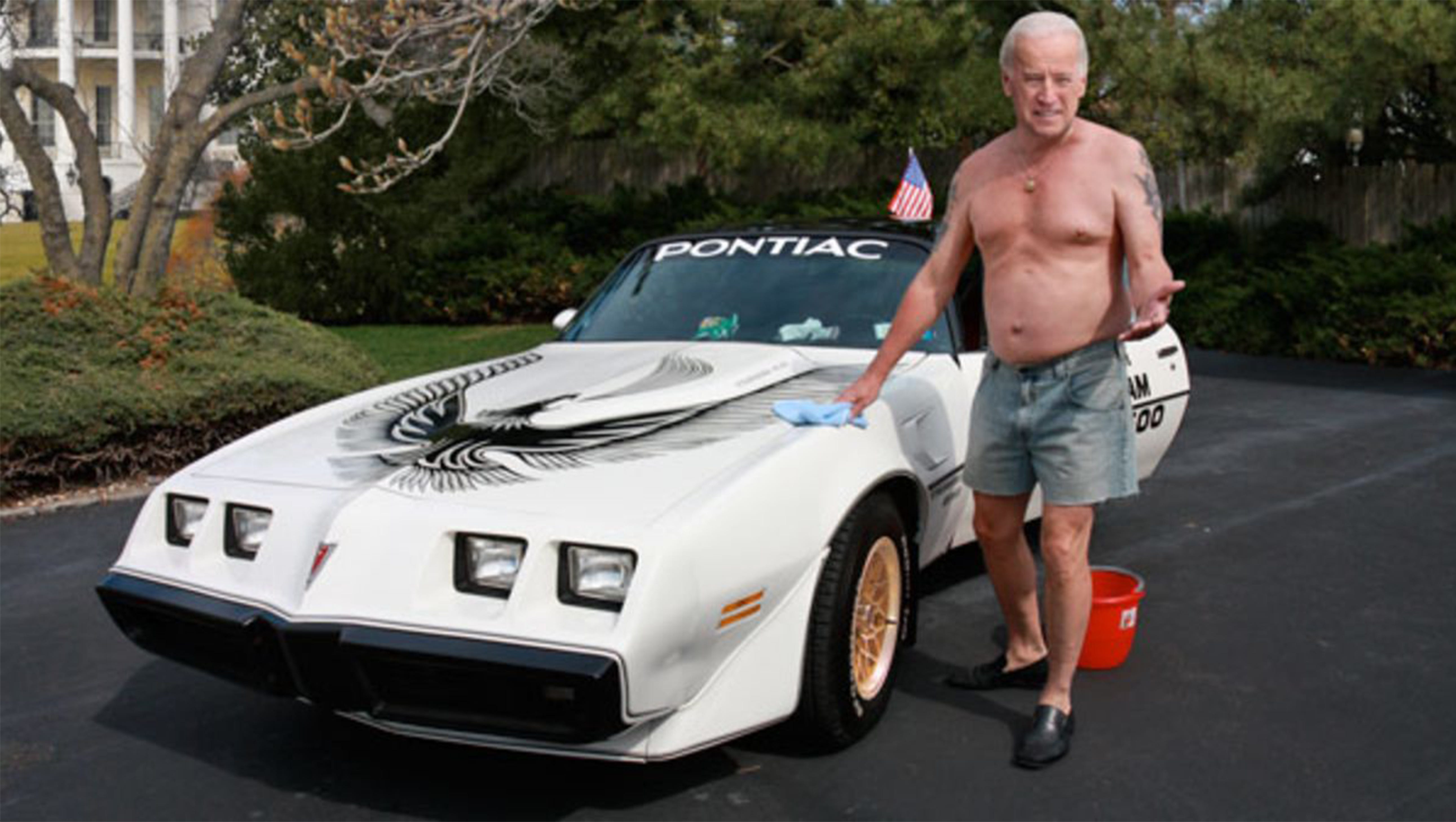
Photoshopped image of Biden washing a 1981 Trans Am in the White House driveway from a 2009 Onion article.
“If you’ve ever thought of Joe Biden as a clueless but lovable clod, a well-meaning klutz who is predictable, friendly, and ultimately electable, I am in small part responsible for that image. And I’m sorry,” Garden wrote. “We were just one small link in a chain of institutions that didn’t scrutinize Biden closely enough. … We helped make him more likable by inventing a version of Biden that never existed.”
The new Biden
Today, the Biden of the Obama years feels like a lifetime ago. The virus has shaped the campaign in ways that deemphasize some of Biden’s most public weaknesses. You can’t be overly touchy when social distancing, for example, and gaffes don’t seem to come as often when campaign events go virtual. Even the culture that gave us Onion Joe is gone, judging by the blowback Jimmy Fallon received for his light treatment of Donald Trump in 2016.
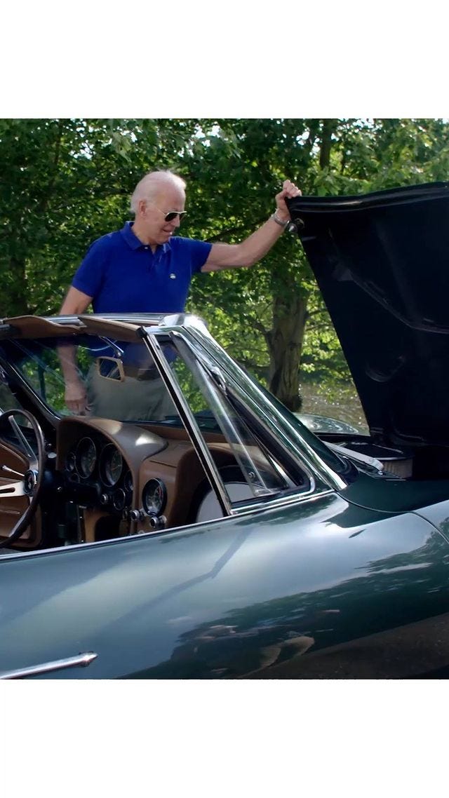
Though the campaign sometimes plays up Biden’s fun-loving image, like posting a video of Biden in shades showing off a vintage Corvette earlier this month, it may hold less appeal when he’s calling to “restore the soul of America.” These are serious times.
Biden’s public image has evolved since being vice president, and his logo evolved since picking a running mate of his own. Designed by Biden creative advisor Robyn Kanner in collaboration with the type foundry Hoefler & Co., the new logo uses their typeface Decimal and replaced “President” with “Harris.” It’s not too different, but visually it comes across as more steady and substantial.
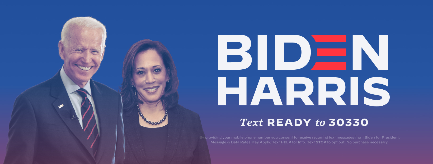
The campaign also introduced red-to-blue gradients in its digital graphics as part of its rebrand. While gradients are a popular trend in design today, you don’t really see them in politics. The gradients used by the Biden campaign are a unique spin on the classic American color scheme, popping on the screen in pink and purple hues.
Along with the campaign’s other new typeface, Mercury, and the campaign's use of classic blue and navy blue instead of the light blue popular among Democratic presidential candidates, Biden’s general election campaign branding has a new, distinct style. You can best see it on the campaign’s @teamjoebiden Instagram account.

Credit: @teamjoebiden/Instagram
Logos don’t win elections, but they do communicate something about the candidate. Biden’s branding has a look that’s current and different. It’s a visual identity that’s grown out of the shadow of Obama’s visual identity, just as Biden hopes to grow out of his role as Obama’s former running mate to the top of the ticket.
Biden’s branding during the primaries felt indebted to the trends that Obama popularized: the clean, modern look; the bold sans-serif typography; the single letter pulled out and altered to become instantly recognizable. Democrats like Biden, Bernie Sanders, and Hillary Clinton have all used visual identities that paid homage to the design legacy of Obama in some way, while still presenting their own unique personality. Biden’s new general election identity doesn’t look quite like anything we’ve seen in politics before, though. It’s post-Obaman.
Top image credit: Imagined Biden brand guideline mockup by Trevor Rowell